Friday, 27 April 2012
Resident evil Nemesis Book Cover
This is one of a set of 6 Images for the Novel "Resident evil" Series. This is Nemisis. A Tyrant set on a mission to exterminate Jill vallentine featured in the front cover with the nemisis shadowed in the background.
Thursday, 26 April 2012
Wednesday, 25 April 2012
ArtWork
These are a set of images i have created and finalised with help of a Freelance Illustrator Graham coming in and setting a week long brief. For the liverpool Sound city. This has pushed me to work within an hour on each of the images, and complete them I did within an hour. With Constructive critisism I have modified and changed the imagery for the better and have learnt on what can improve me work with this.
Friday, 20 April 2012
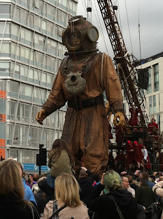
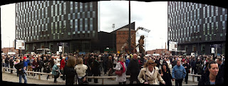
Liverpool _ Titanic Photo Journalism
The Giants was a project after a letter was found from a 9 year old girl who sent it to her father whom was on the Titanic before it Sank. This 3 day set of giants is in spirit of this.
Thursday, 19 April 2012
Metal Gear Solid Peace walker Cut scenes
http://www.youtube.com/watch?feature=endscreen&NR=1&v=3U0ScFpgqDw
Recently I have been playing metal gear solid peace walker. With a stella cast and unparralled story telling, through out the games, but on transfer from console to hand held, MGS peace walker has had an over haul with its graphics from cut scenes. Introducing Ashley wood, He has individual way of working, and this shows in stunning cut scenes throughout the game, in almost a comic style with such sophistication.
Recently I have been playing metal gear solid peace walker. With a stella cast and unparralled story telling, through out the games, but on transfer from console to hand held, MGS peace walker has had an over haul with its graphics from cut scenes. Introducing Ashley wood, He has individual way of working, and this shows in stunning cut scenes throughout the game, in almost a comic style with such sophistication.
Wednesday, 18 April 2012
Final team GB posters
These are a final set of imagery that I've worked on for TEAM GB. I most like the block colouring and the colouring used as several layers used and overlaid with effects run through them. As there was with the Design for the London 2012 Team GB kit, the designer made a few modifications to the design of the kit with coulors, greatly muting the red, and substituting it for a blue instead. which I have reversed. I have put in more red, a little less blue, and a hint of gold throughout the images, which is a nice touch I find.
Friday, 13 April 2012
Subscribe to:
Comments (Atom)


